December 24, 2013

Another Grisaille

Another crack at doing a Grisaille. It's weird, I've seen the grisaille method taught a couple of different ways so I'm not sure which is really the "right" one. The way I'm trying it here is the way Rob Liberace teaches it on his DVD entitled "Grisaille." I don't have this method down perfect as I'm still learning, but it is fun just giving it a shot.


Grisaille
11 x 14 - Oil on linen

December 13, 2013

Something Different

So I thought I'd try something a little different for me. Today at the Friday live model painting session at Bay Arts I decided to limit my color palette and go for a kind of "chiaroscuro" effect using basically a grisaille technique. It was fun, concentrating mostly on value with only a little warm and cool consideration. I may just try some more of this as I think it might help my overall painting efforts. Taking this shot with my camera I think there is some glare that is affecting the image and so I might try re-taking it later and updating. It's weird but some of the darks have separated and jump out in a way that you don't see in person, but I decided to go ahead and post it anyway so for now you can see it more or less.

Even with fewer colors to think about I think I may still have gone a little overboard with the value of the shadows, but overall it was still a good experience.


Michael - Chiaroscuro
11 x 14 - Oil on Linen


December 09, 2013

Melissa

Another practice attempt. Just trying to get better. I think some of the values may have gotten a little "jumpy." I'm not sure if the values are holding the form together. I'd like to get a little tighter with my values overall.  By that I mean I think at times I over or underestimate them to where things can get a little disjointed looking. They're not super far off, but enough to where they bother me some.

Oh well, like I said, just trying to get better. 

Oh and BTW, I didn't catch the models name again so I made one up.


Melissa
Oil on Canvas Paper - 11 x 14


November 29, 2013

New Sheriff In Town

Did this portrait of a gentleman that was nice enough to pose for me at the Great Trails Festival in Malvern. I thought he had a great look with lots of character that came right out of the old west. I think I may still add a Sheriff's star to his vest at a later date but for now I'll call this one done.


New Sheriff In Town
Oil on Linen - 11" x 14"

November 26, 2013

Michael - 3/4 view

Another portrait of Michael, this time in a 3/4 view. I wound up wiping out my original effort as things were off. I'm not supposed to say this but I'm not real crazy about this one, but as per my motto I try to complete anything I start. The likeness is okay, but that's mostly because I was able to refer to the photo I took. It seems whenever I have to rely too much on photos the spark just goes out of the painting. I think I can get to a point where I can train myself to use photo reference in the "right" way (that's hard to define), but I'm not there yet. As always it's a learning experience so from that standpoint I still consider it a success...just not exactly where I want to be, if that makes any sense.


Michael - 3/4 view
Oil on canvas paper - 11" x 14"

November 14, 2013

Shiny Pot with Roses

Another still-life. I think I'm starting to be a little less resistant to still-life painting. It is easier to find stuff to paint than it is to find a model after all, so why not go for it.

My wife saw this shiny pot at a thrift store and picked it up for me to add to my collection of "stuff" for painting. Tina is very supportive of me in my painting endeavors and it means a lot to have someone you love take such an attitude. I don't know if it would be possible to pursue this painting thing if she wasn't standing beside me in that way. Thank you my love!

Anyway, even though I have been thinking about it, I have been very nervous about painting shiny objects. I think because of what I perceived to be such an overload of information to have to paint. 

But that was my old way of thinking. By nature I was always a "noodler." Someone who, in their art, had to noodle everything to practically a molecular level. I don't want to do that now. There is a space somewhere between realism and impressionism that I really like. It really speaks to me whenever I see it. For me it is an attractive way to go if for no other reason than it saves time and you can complete more paintings in a shorter amount of time. But I think it's also the "less is more" thing that I like. It is an effort though to see things differently than I used to. 

Don't get me wrong. Highly detailed art is great for those that love to do it and it is totally valid as a means of self-expression. And I do admire the skill, patience, and even the aesthetics of this kind of work. But fortunately God has hard-wired us all a little differently, I think, and so different kinds of art will speak to different kinds of people. I'm not one of those people that believes that only Rembrandt, for example created great art, or did "real" painting. Just because something doesn't speak to me it doesn't mean it won't connect with someone else. That's not to say I don't have opinions about art, but that's the subject for another post ;-) 

This one is a little smallish for me.  I had fun doing it.  Hope you like it.


Shiny Teapot Pot and Roses
Oil on canvas board - 8" x 10" 


November 10, 2013

Some New Portraits

So here are a couple of recent portraits that I did at the Friday portrait painting open studio at Bay Arts. People, figures, portraits are really what I like doing best and I hope to continue to try to improve at doing them.

One thing that I have considered myself quite ignorant of are the various painting surfaces that different artists like to use. I've always painted on cotton canvas (or duck), canvas board or canvas paper. They're cheap and readily available. As a comparison, it always seemed to me that if Tiger Woods picked up my store bought clubs he could still play a heck of a round. Similarly, if Sargent or some other great painter used the canvases that I used he could still produce a masterpiece. So I figured, what's the big deal? 

Anyway, I always hear and read about artists who choose to paint on linen. I'd never painted on linen and so I thought I should find out what all the fuss is about. This past summer I participated in a workshop with Stanka Kordic who is a very fine figurative artist. She had mentioned how she paints on linen which is glued to board. She gets it from a company called New Traditions Art Panels. I decided to check out their website. They offer lots of different grades of canvas and boards, which in my case made it hard to know where to begin. Fortunately they had what they called a sample pack of about six different surfaces, primed and glued to gator foam, which is a denser, sturdier version of what I knew as foamcore presentation board. I thought this would be a great way to go ahead and experiment to see if there really were any differences or advantages to painting on linen. I went ahead and ordered a sample pack and did this latest portrait trying one which was about in the middle of the pack in terms of texture or weave. I do have to admit that I really like painting on it. It's hard to explain but the feel of the paint going onto the surface was just a better experience, and I liked the way the painting turned out. But that could just be coincidence.

Oh and I also included some close-up details so you could see some of the texture and brushwork better. 

Hope you like them.


"Bill"
Oil on Canvas - 16" x 20"


"Bill"
Detail


"Michael"
Oil on linen panel - 11" x 14"


"Michael"
Detail

October 19, 2013

Two Still-Life paintings


"Cherub"
Oil on canvas - 11" x 14"


"Red Sash"
Oil on canvas - 20" x 24"

So I'm not necessarily the biggest fan of still-life paintings, although I acknowledge there are some really great still-life painters around with awesome skill. But when you don't always have living, breathing human beings at the ready you do what you need to do to keep painting. So here are 2 modest attempts at setting up and painting some still-lifes.

Am I happy with these? Again as usual the answer seems to be yes and no. I feel as though I learned some things which is good. But I also know there are some things that I'm not crazy about. Even though I knew after I had started that things were not going as I'd hoped I decided to stick with it. I find that even if I am frustrated during the course of doing a painting, if I stick with it to completion I'm better off, because often even if I'm overall dissatisfied with the painting, good things do happen. It can be a bit of a roller-coaster ride emotionally. So I try to commit to finishing a painting almost always, no matter what.

I do think that 20" x 24" though is too big a painting for me to tackle at this stage. It really taxes your concentration and the buildup of frustration can be tough to ride through. Especially if you only have a few hours a night to paint.


August 31, 2013

AG Creative Gallery Show

American Greetings, the company I work for, has a company gallery that they make available for any of the artists who have a desire to display their work. The artists do have to submit examples of their work beforehand for review for appropriateness and sufficient quality. 

Around a year ago I approached a couple of friends/co-workers to see if they would want to do a show together. We all agreed. I thought it would be a good goal and a good way to motivate myself to continue painting over the year. It has been. When you know you have all that empty wall space that has to be filled it is a great motivator. I managed to get ten paintings completed and framed so I felt that wasn't too bad. I would have had more but I actually gave some away as gifts. I don't think I'll be doing that too much in the future.

Anyway I participated in the show with Cindy Patton, who did some really nice pastels of outdoor scenes as well as some nice still-lifes in watercolor and oils, and with Todd Pollino who does some really great watercolors of nostalgic looking businesses that he has come across over the years.


August 05, 2013

Cody

"Cody"

Oil on Canvas Paper - 11" x 14"


This was a 2 hour long study with some touching up after the sitting. I'd say the portrait was about 90% done after the 2 hours so I think my speed is improving. 

I've been harping a lot on speed and I'm not sure that's a proper emphasis. Some really great paintings look as though they were done quickly but it's not the case. Anyway, I think as long as I do things in a measured way I'll be all right.


July 31, 2013

Nifty Little Painting Station

As I've been trying to gradually put together a painting studio at home I realized I needed some kind of decent painting station to work from. I began looking at most of the usual art supply websites and I just couldn't find one I either liked, or was willing to shell out the kind of money they were asking for, especially based on where I was from an (in)experience standpoint. 

Anyway, so I'm out shopping for some cheap item, I can't even remember what it was, and decided to check out Wal-Mart, when what do I spy but this little number they sell as a Kitchen island station. 

Just what the doctor ordered! It was right around a hundred bucks. Way less dinero and more efficient than anything I'd found up to that point. I ordered a sheet of glass with a ground edge for about $15 to use as my palette and I really love this thing. It's got storage, a flip-up shelf/work area, a drawer which will hold lots of paint, and cabinets for other stuff. It's on casters that lock so you can move it around and lock it into place. It also has a towel bar. Not quite big enough for paper towels, but that's okay for me.

If you're at Wal-Mart check it out and see if I'm not right on this one.


July 08, 2013

Madison

"Madison"

Oil on Canvas Paper - 11" x 14"

This is my most recent portrait done of a lovely young lady who posed at the Friday afternoon figure painting session at Bay Arts. For those that have seen this painting before under a different title, I had to make one up at the time as I did not catch her name. I've since found out it was "Madison" so there you go.  :-)

Once again, I did not complete it in the 3 hours the session is held, but I'd say it was about 80% done. I did have to re-do the drawing somewhat at home as I noticed that her nose had gotten too long in my original attempt. But I managed to keep all my color notes intact as well as the basic feel of that original sitting. I did some dry scumbling which I've been avoiding doing because I want to keep the painting wet as much as possible. I know it's not the case, but glazing and scumbling feel like cheating to me, but then that's just my hang up. 

Overall I think I'm most pleased with this one so far. I've managed to let some greenish tones show through the skin tone. Much easier since she was rather olivey in her complexion. Mike Malm once said to me (he may not have been the first to say this) that "value does all the work but color gets all the credit." Meaning if your values are dead on, it allows you to push the color in ways you may not necessarily see in nature, but it will still appear right.

I'm trying to do that. I think I had some success here. I hope so anyway.  :-)

July 07, 2013

Why Copy?

 Dan Gerhatz copy - 1

Oil on Canvas Paper - 12" x 16"


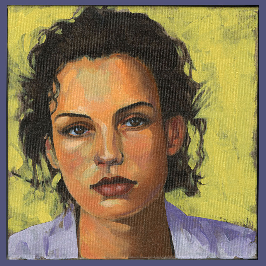
Dan Gerhartz copy - 2

Oil on Canvas Paper - 16" x 20"

So why copy the work of other artists? Well, when they are really, really good artists you can learn a heck of a lot. 
One artist whose work I really admire is Dan Gerhartz. His work really resonates with me, because of his love of painting people. He has a great compositional sense, is keenly aware of very subtle changes in temperature (of paint, not room) and draws and handles the brush extremely well, at least as much as I am able to tell.

Anyway, these 2 particular copies of Dan's work I found to be very helpful in my personal work. The first one was really just an attempt to get looser with my brushwork, painting quickly, as well as experimenting with a palette knife. which I really don't know how to use with much proficiency at all. I don't know if Gerhartz used the knife in the headband as I did, but I thought it was just a good opportunity to try. Also I noticed some light blue tones in the skin of the forehead area, which I would probably not use on my own. I tried it and it seemed to work okay. So there's a good indicator of how I learned to do something I normally wouldn't do and have it turn out fairly well.

The second one was an exercise in having the features of the face done in mostly shadow. This is about the darkest I've gone with a portrait. I didn't capture a lot of the subtlety of temperature changes of Dan's portrait, but I think I got close in some places. When I did the hair I couldn't/didn't see what Dan saw and so all I could see when looking at Dan's painting were shapes and masses and so it probably doesn't convey "hair" and the beautiful reflections and highlights the way his painting does. I really loved the loose brushwork around the collar of the girl in Dan's painting, so even just trying to replicate that was a great exercise.  

Some people might say that the goal of an artist is originality. Well maybe, maybe not.
I think the goal, my goal at least as an artist is proficiency. I think persistence in excellence should be the painters goal. Individuality will "out" naturally and eventually, so I'm not worried about the eternal quest for originality. I have plenty of my own ideas to keep me busy, but at this point I think it would be wrong to try to jump ahead and bypass quality and proficiency just for the sake of originality.

And don't forget to acknowledge the people who have helped and influenced you with their work and words on your journey.

Thanks Dan!


July 02, 2013

Kim

"Kim"

Oil on canvas - 16" x 20"

So this was my first try at doing a subject from life and setting it all up myself. This is Kim, a friend from church that I'd asked to pose for me. I always thought she had a great look, kind of mysterious, but very lovely and honest. I don't know that I did her justice. The flower arrangement could have been better thought out and I think more in general could have been done with the composition. I'm also not certain about the handling of the skin. Not enough variety of edges, I think. It's easy for me to be very self-critical about a piece like this, but again a great experience I think towards doing better paintings in the future.

July 01, 2013

Julie - Study

"Julie - Study"

Oil on Canvas Paper - 11" x 14"

So if you had asked me which is my favorite painting I had done up to this time, this one would be it. Why? It's because I actually completed this one from life and it has some of the expressiveness of brushwork that I've been striving for. It's not a masterpiece, but for me it means a lot, because it tells me that there is hope towards actually completing a future, more ambitious (and yes, even salable) composition in one or more settings from life. What has been the key for me? Probably like most things, it's practice and more practice. In this way you become more comfortable with the medium and your tools.
Other people have helped too. I'm not an island. I run things past people whose opinions I respect and who will give me straightforward input. Also, I find that nowadays, if you can't make it to an actual workshop, instructional DVD's can be a good way to go. I have a few that have really helped me. They are as follows:

• The Alla Prima Portrait and
• Grisaille
   Both by Rob Liberace
• Gesture Portraits by Geoffrey Watts
• Her Mother's Locket by Dan Gerhartz
• Nuts and Bolts by Quang Ho.

That last one has really helped me out a lot. Plus Ho is very philosophical and I tend to be as well so a lot of his anecdotes and analogies make a great deal of sense to me. He does a lot of talking in it and that might bother some who just want to see straight-forward instruction, but to me his concepts help to make clear what painting and art in general is all about.

Young Girl

"Young Girl"

Oil on Canvas Board - 11" x 14"


I did this smaller painting of a young girl that modeled for a group at Mike Malm's workshop which I attended in June of 2010. I wish I could say that I had completed it at the workshop when the model was live in front of me, but I can't in truth. I really was so incompetent at that time when it came to painting an actual person that I really just fumbled around, trying to pick up and absorb all the information I could to use at a later date, when hopefully it would all make more sense to me. Fortunately it does make more sense now. Even though I think this painting shows signs of improvement and areas that I like, overall I think it's too tight and blended. That's not how I want to paint. My preference is to paint more directly and expressively. To capture mood and atmosphere. I'm not there yet, but I think there is hope. 

At least I hope there's hope for me.

June 27, 2013

Julie

"Julie"

Oil on canvas 11" x 14"

Finally an opportunity to paint from life. This model was one that came to sit for a Friday afternoon painting group at Bay Arts. The model usually poses for 3 hours with breaks. I didn't quite finish it there, but I snapped a few shots with my phone and was able to complete it at home. I'd say I had it 75% complete when I brought it back home, so my speed still needs some attention. But overall I'm satisfied with my progress. And yes, painting from life is much more challenging, but in my estimation, much more rewarding  because working from life is where your greatest strides as a painter are made. I've heard it said and it's true, that the camera just cannot capture all the nuance of chroma and hue the way the human eye can. Even with HDR.

This painting is another mixed bag in terms of results, but hey, it's a study, so I can't get too crazy about what's not perfect about it. Progress is happening, so I'm happy.

June 26, 2013

Royal Blue

Royal Blue

Oil on Canvas 16" x 20"

Okay, so it's kind of fashiony, but I like it... for the most part that is. It's funny but I don't feel that I'm ever completely happy with anything I've painted so far. Maybe that will come, but for now I'm feeling fairly good about this one.  Good enough to make the girl part of my banner, as you can see. It may seem strange but one of the things I feel best about in this painting is the sky and background. I know it's kind of a nebulous thing but I felt like when I was painting that sky I was painting in what I heard Quang Ho call the second, or maybe even the third level. That is painting without thinking, kind of in the zone, like when a musician loses all sense of mechanics and just "does" music. It may not show, but it was how I felt at the time. 

Now if I could just spread that feeling around to the whole painting.


June 25, 2013

Woodworker

"Woodworker" 
 Oil on canvas 16" x 20"

I took this gentleman's picture at an outdoor fair in Malvern Ohio. They had lots of people dressed up in period costumes and so I'd asked him if I could snap his picture for a painting. He was more than happy to oblige and this painting resulted.

The setting was originally outdoors, but I changed it up as I thought the indoor setting worked better. I tried to keep the background loose in contrast with the subject. I think that part was ok, but after I'd finished I realized that there was really not enough variety of edges, which helps to create atmosphere, as I was still painting "up to the line." That said I think it was a tough painting to do and I felt as though I had made some positive steps.

June 24, 2013

Type and Technique

Attitude
Oil on canvas 16" x 20"

So, this is probably my first real attempt at doing a full figure painting.  This was done in late 2012. Again as with most of what I've done to date, there are things I like and there are lots of things to work on. But overall a really good experience on the road to competence.

My main goal in this painting was to think about "type" and technique. Once again, unfortunately this painting is from a photograph. I loved the attitude that the girl in the photo evoked. I tried not to copy too much and instead concentrated on looseness in the right places. I think in some places I was successful, but in others not so much. I have a lot to learn but I feel like I'm at least headed in the right direction.

A Few Early Attempts

 Alex


 Magdeline


Ian

All three of these paintings were early efforts at portraits. I did others but these are fairly representative of how I began taking up oils in color. Considering these are my first crack at doing more serious portraits, I suppose there are some things that I like about them, but plenty that I don't like. I won't say what I am not happy with and am content with others making their own judgments. I was definitely very inexperienced then, and still am, and I think it showed (and still does).

The first one is of my niece, Alex. She was a very good model. The second is a photograph ad that I found. I tried not to copy the photo directly and instead tried to play with some of the brushwork and color, as well as changing around some of the models features. The third one is of my son Ian. This was from a photograph I took under some really bad lighting.

June 23, 2013

A Tip O' the Hat

Before I get too far into this archive/journal (which is it anyway?) I have to give a shout out to Mike Malm for being the one (besides my wife... that's another post) to really help me get my feet wet in terms of thinking about how to approach the painting of people and figures in the medium of oil. A few years back I had the good fortune to take one of Mike's 3-day workshops at his studio in Wellsville, Utah. He has this really great studio to work in, and he was very patient and helpful, especially for me being such a beginner in this medium. But the thing that stood out to me most was Mike's (and Juanita's) kindness and sincerity towards me. They have a beautiful family and they couldn't have been better hosts, especially as I was a complete noob to the area.

If you have an opportunity to take one of Mike's workshops, do so. You won't be sorry.


Mike and Juanita Malm in front of one of Mike's beautiful paintings.

First Baby Steps


So, this is more or less where I'm beginning. I did several of these quick (for me), monochromatic small studies of different ethnic "types." They were supposed to be quick anyway, around an hour, but I could never finish one quite that fast. They would generally take me around 1-1/2 to 2 hrs. Then as now, I'm hoping that my speed picks up. They are monochromatic because at that point I really just needed to get a feel for the medium of oil paint and it's technical properties and aspects without having to worry about color as well. I think for anyone considering starting painting in oils, these kinds of monochromatic studies are a good way to begin. 

This, and my other quick studies were not from life, but from some old national geographic photos. I was not at a point yet where painting from life was an option for me. so this would have to do. I understand now, even more than before that painting from life is ALWAYS preferable, but sometimes it's just not feasible nor practical

My goal is to paint realism. But not photo-realism. There is a space between impressionism and realism that I've always been drawn to and hope to gain some proficiency in. I'm a noodler by nature, which means that I tend to over-render. I feel that I don't want to do that anymore, as it takes a great deal of time. It's hard to get away from, but I'm striving for looseness and atmosphere in my art rather than exactness. That takes lots and lots of practice... but I'm willing.